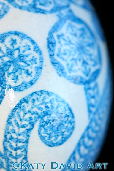
Revisiting a design this week, somewhat opposite color scheme from a few weeks ago. I think that this one is not as strong, but I don't know that it is a bad thing. Just different. I do wish that I had etched this one to give some more emphasis to the design. The mottled effect of the dye is bothering me as I think it makes the design seem out of focus or blurry. But then maybe I should just stop comparing the two and give them each a chance to shine.
Happy Friday!


No comments:
Post a Comment